A new year is almost upon us and with it are new artistic and design trends.
I don’t recommend following trends if you’re established, but if you’re looking to form a brand and don’t where to look visually, this will give you some ideas as to where to start looking.
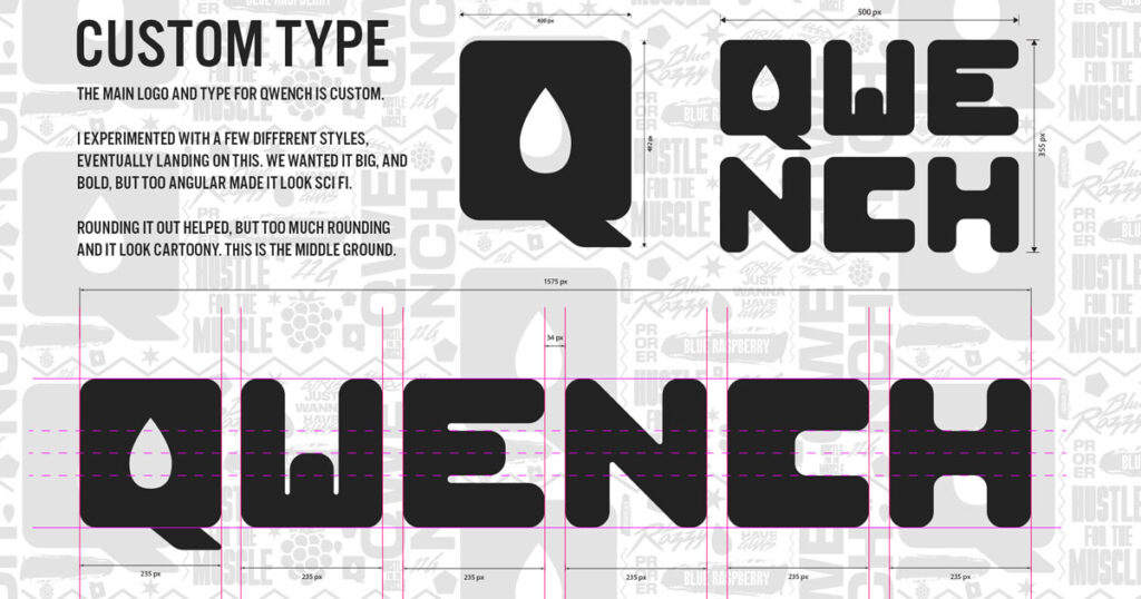
An on brand font simply isn’t enough anymore. Your brand should look at custom typography as a way to highly differentiate yourself. We have seen this over the last year or so, but mostly for quirky or playful brands. Prepare to see this expand into more serious and professional brands as a way to highly differentiate themselves from their competition, while remaining professional. (This is from a project I worked on called QWENCH, you can find that here.)
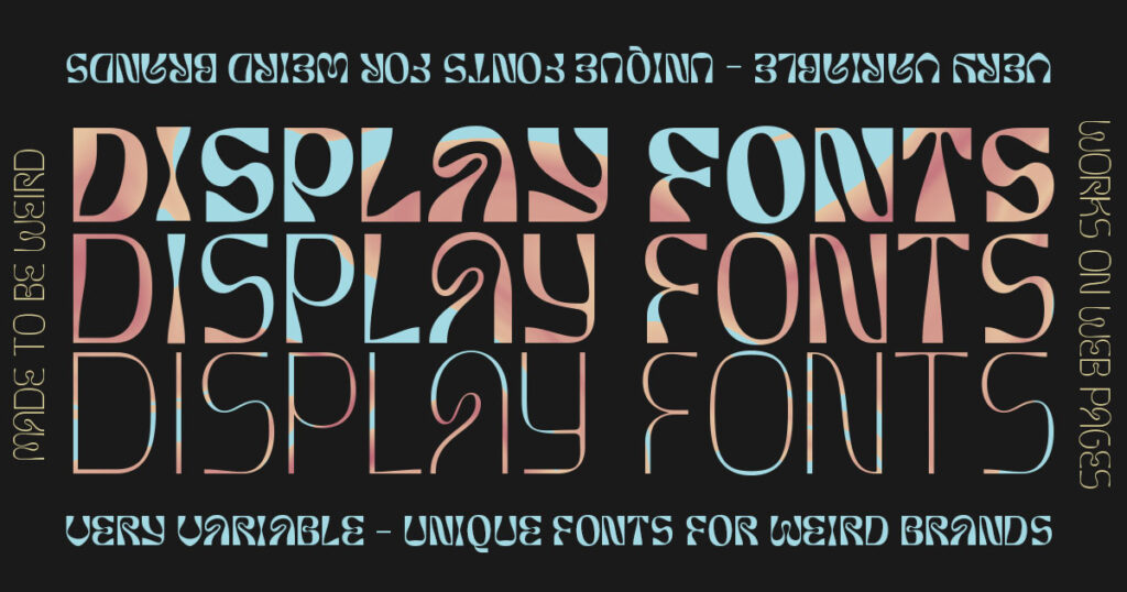
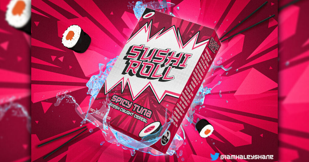
Pairing with custom type is display fonts. Display fonts are typically highly detailed or intricate fonts, designed to be be seen at a large size, usually on a webpage. Having an experimental, oversized font is a guaranteed way to get people to perk up and pay attention. These attention-grabbing fonts aren’t just for digital mediums, they work well on packaging too.
When I say texture I am not talking about your typical “grunge overlay 005” you have. Texture is going to get really detailed this year. Take some paint brushes and draw your logo with them. Draw it on masking tape, use mustard on a piece of metal and see what that looks like. Texture and liquid elements are meant to make a brand feel alive and dynamic.
These custom textures are something that I offer in my Done-In-Person packages. You can check those out here if you’re interested in some truly personalized textures.
Brand characters in a contemporary style are more accessible than a brand mascot, and allows more freedom overall. Quirky illustrations paired with these with some subtle animation and movement make a brand feel more accessible, and aid in storytelling. This is especially effective if your customers respond well to nostalgia.
Creating movement within static images. Not every platform needs video, so implied motion through graphic design is a great tool to have in your brand kit. This works extremely well for product based brands, especially those that are retail based. Using 3D elements you can create the illusion of animation in a static image and capture the attention if your potential audience.
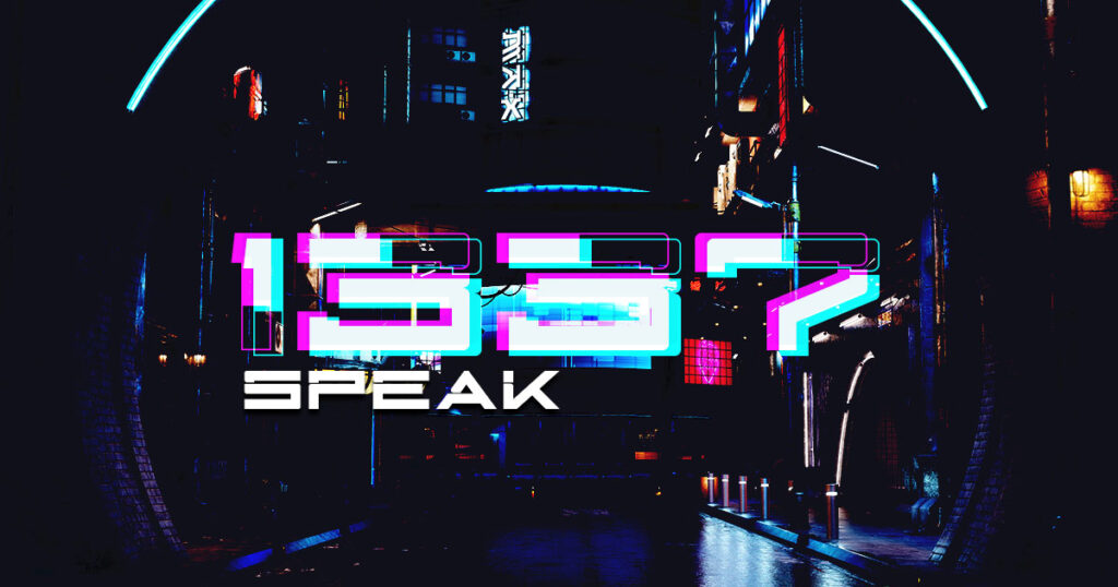
This is a weird one, and I could be wrong about it but I think “leet speak” is going to make a comeback. It’s quirky, it’s weird, boomers won’t get it and that’s funny to the audience that would use it. At a utility level, names are being gobbled up quickly, so supplementing letters with numbers opens up a lot of possible names/URLs.
If you think I’m missing something, reach out to me on Twitter and let me know.