
If you take your business seriously you will eventually hire someone to create your brand identity. There can be a lot of pieces such as logos, patterns, textures, color pallets, and font choices. What do you prioritize? How do you know what you need? What extra nice-to-haves do you need to spend the extra money on?
That’s what I hope to clear up in this post.
This is what you have to have when your branding becomes priority number one. A basic list of deliverables you should be asking about and pricing accordingly if you’re shopping around. This will help you narrow down what packages you should look at, and compare budgets while you’re at it.
The foundation of all brand visuals, the logo. Your logo should be memorable, and work in a variety of mediums and sizes. This will be the first thing that you have done, even in a larger package that includes more deliverables. If you nail this the rest of the visuals get easier. A solid logo is a solid base to work from.
Cover photos, Profile Pictures, are all necessary these days to ensure brand consistency across multiple touchpoints. Social Media is usually the first impression a brand makes to most of it’s customers, so it’s important you have this dialed in with the rest of the brand.
If you sell a physical product your packaging design can be the difference in getting a sale or not. It’s imperative you take this into consideration if you sell something that can fit on a shelf at a store, or if you’re doing DTC. We do judge books by their cover, that’s the whole point of a cover. If your packaging design is cheap, people will assume what’s inside the jar is too. Don’t skimp on this.
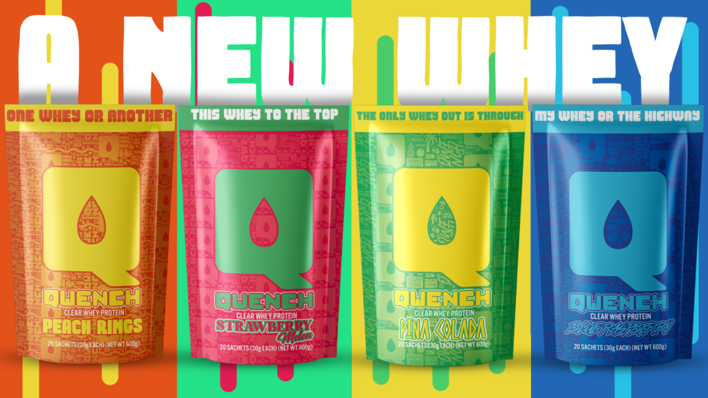
To match your new packaging design, product mockups for your website and shop listings are a high ROI asset to keep for your brand. It looks professional and helps instill trust in the potential consumers of your product. If you really want to do this right, spring for product photography as well. Some high quality rendered mockups will do the trick fine if you can’t do the real photos right now. Pro Tip: if you get them rendered with transparent backgrounds, you’ll find uses for them all over the place.
These are things you should consider in the future to further improve brand consistency and consumer trust. You don’t have to start with them, but they do make things easier in the future.
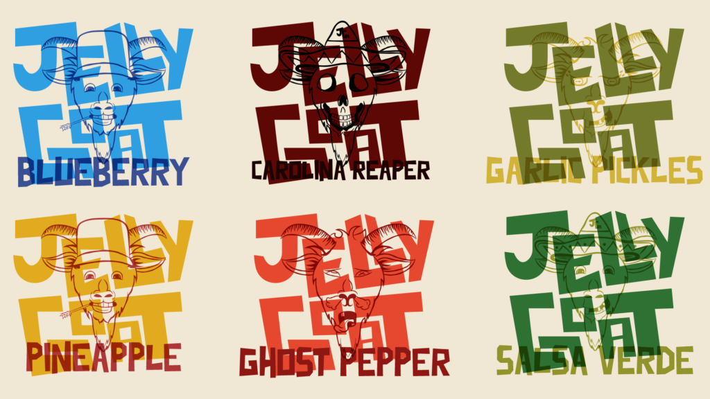
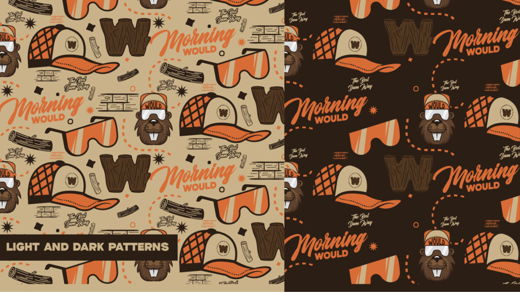
Patterns are like Frank’s Red Hot Sauce, you can put that shit on everything. Social media posts, ads, packaging tape, box fil ins, you name it. There’s not many places a pattern specifically tailored for your brand doesn’t work. I like to offer a variety of these to ensure the best use case on anything. (And because they’re fun.) You’ll find places to use these, I promise.
Not everyone is cool enough to have custom typography. It’s expensive, and can be a little time consuming even for someone as fast as me. However, the benefits you get in a highly differentiated brand are worth the time and money. Using the same typefaces across mediums makes you look consistent. But when that typeface was created just for you, and no one has ever seen it before? You look like a total baller in a world of bench sitting brands.
If you’re running ads or just posting organically on social media, ad creative is something you can never have enough of. I usually offer a flat rate package for this for my clients. X amount of images for one cost. They can get as many as they need and stay on top of the timeline with them. See what works best with organic traffic, then scale that up slowly with paid ads. This can help influence what the rest of the creative should look like so you can get more bang for your buck.
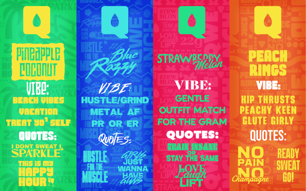
The words you use are just as important for your overall identity as your visuals. Verbal Identity is part of brand identity, despite popular opinion. Consider a verbal identity guide to go with your visual brand guidelines. If you outsource your social media or copywriting, this will be worth its weight in gold. You want any designer that touches your visuals to remain consistent, so why wouldn’t the people speaking for your brand be held to the same standard?
If you’re really trying to squeeze every last bit of creative juice out of you brand, here’s what you need to stand out and make the competition mad. These are long term “ooh look at us, we’re fancy.” things. They’re very cool, but they are extra af.
These will be for any designer you hire to use. Custom textures and Photoshop Brushes for them to use that were made specifically for your brand. No generic “splatter texture 006” here, these are for you and only you. When I work with clients in person, I get high quality pictures of their surroundings and make brushes and textures out of that. What better way to get customized than to use the ground they walk on every day in their brand.
Load animations for your website are important if you have a bigger site that takes a bit to load. Custom animations that show your brand personality is that little extra that can set you apart. Especially when you have multiple that pop up randomly and encourage people to find them all like Pokemon.
Would it be cool to watch Steve Jobs or Jeff Bezos when they first started? Of course it would. They started at a time when technology didn’t make that possible, but we have that opportunity now. A video from start to finish that explains why you started your business, and shows the passion you have for it is evergreen and invaluable in what it brings. You’ll be hard pressed to find brands doing it because as far as I know, I’m the only one that offers it as part of my Untamed Package.
Take this list to your preferred designer and start working to make your brand look like it needs to be taken seriously. If you don’t already have a designer, I’d love the opportunity to become the go-to for you. Hit me up and lets see what I can for you. If you want more content like this, give me a follow on Twitter (X)