Tranquilitas is an anti-anxiety drink powder for busy, corporate professional women. I was tasked with bring the visual identity to life, and helping attract it’s target audience.
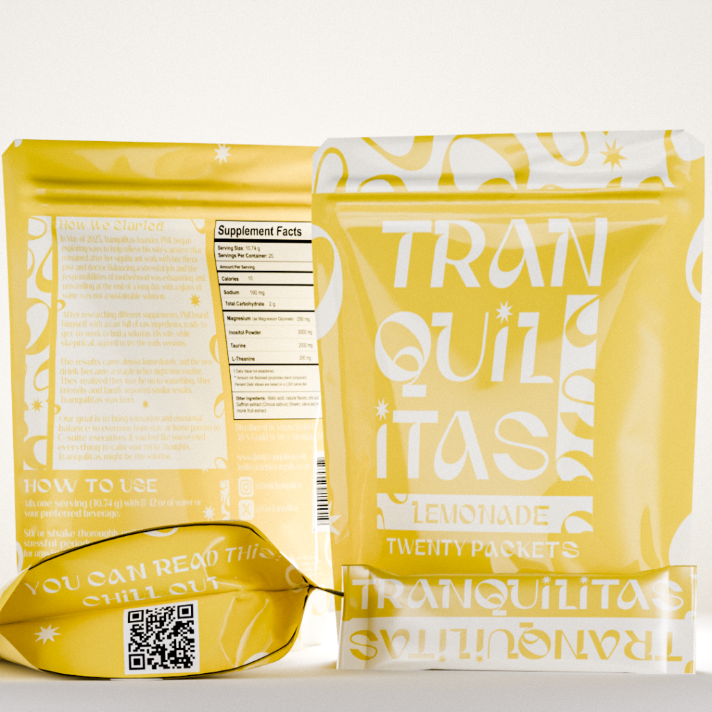
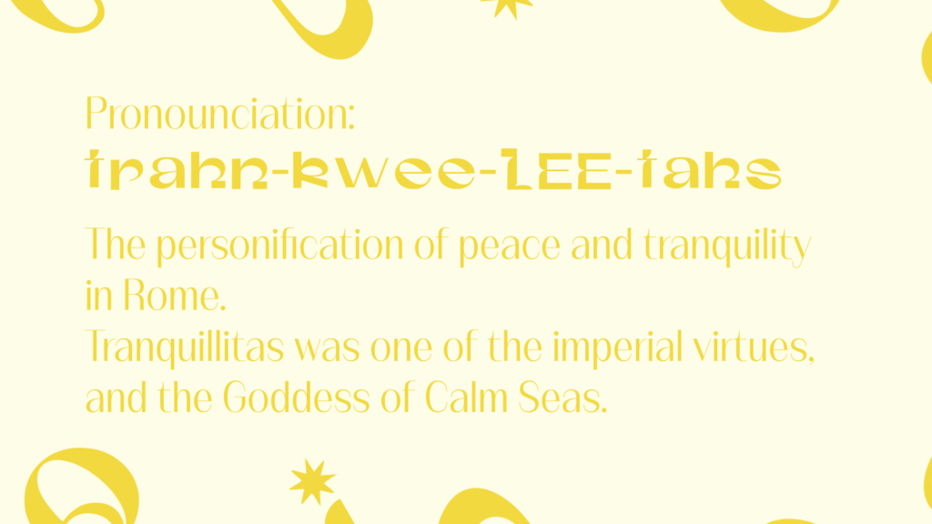
With names becoming harder and harder to find and trademark, you usually need to make one up. Phil, the owner, did just that. But an issue I saw early on was the clear pronunciation of the brand name. We dug into the root of the name, Originating from Latin, and being based on a minor Roman Goddess’. A perfect backstory for the audience to resonate with, so to clear up the name, we just stuck this short story about it right on the packaging.
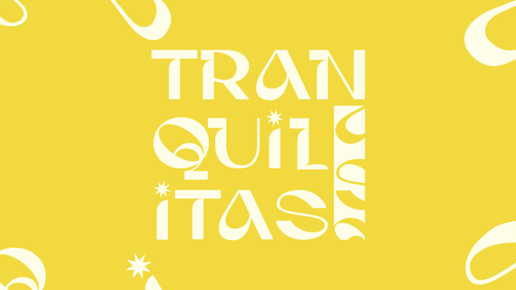
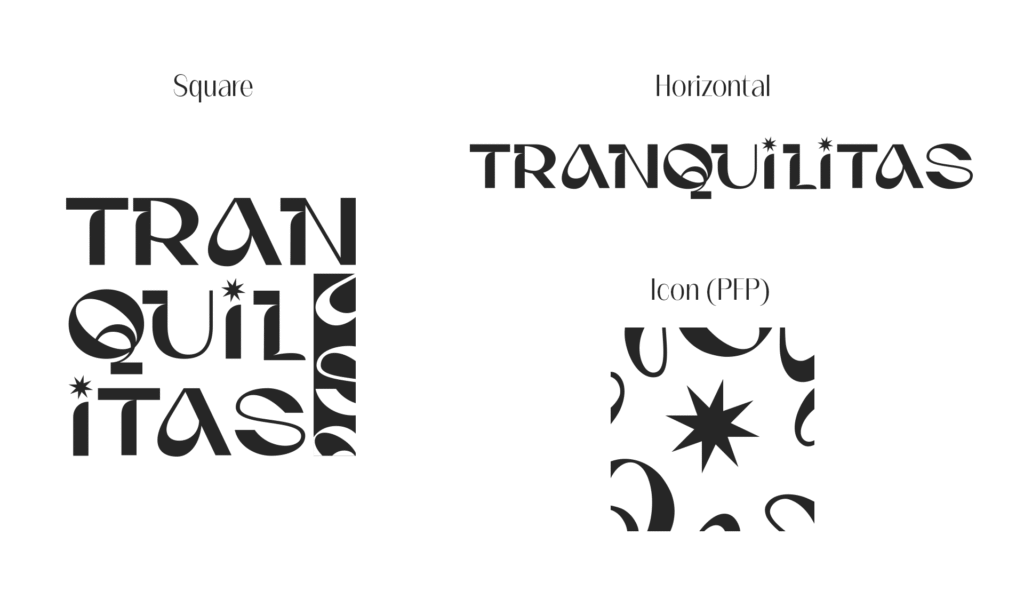
Next, I tackled the logo. Square, horizontal, and icon (PFP friendly) versions were all created, and give us branding options on small packaging options, like stick packs, which will be used.
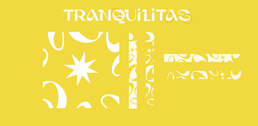
Next, I made some custom patterns to add some playfulness and life to the brand. I liked the typeface so much, I just used pieces of it to create these organic, but structured shapes that can play with the brand visuals in different ways.
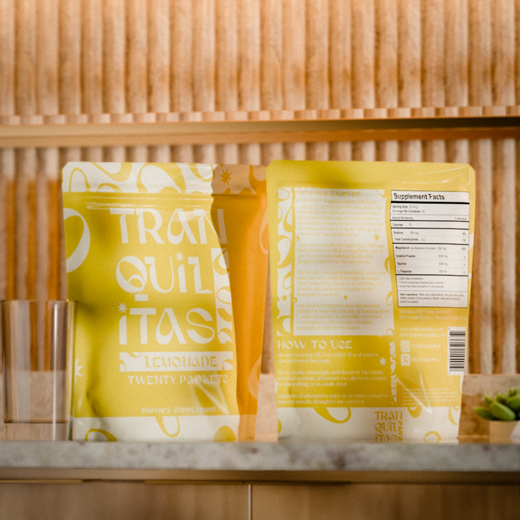
Once the visual identity was solidified, I got to work on 3D renders. Renders are great if you don’t have your product in hand yet for product photos, but need to get your store up and running. These are close to photorealistic, so they act as an accurate representation of the product to the customers.